Painting Discovery
Painting Discovery
About
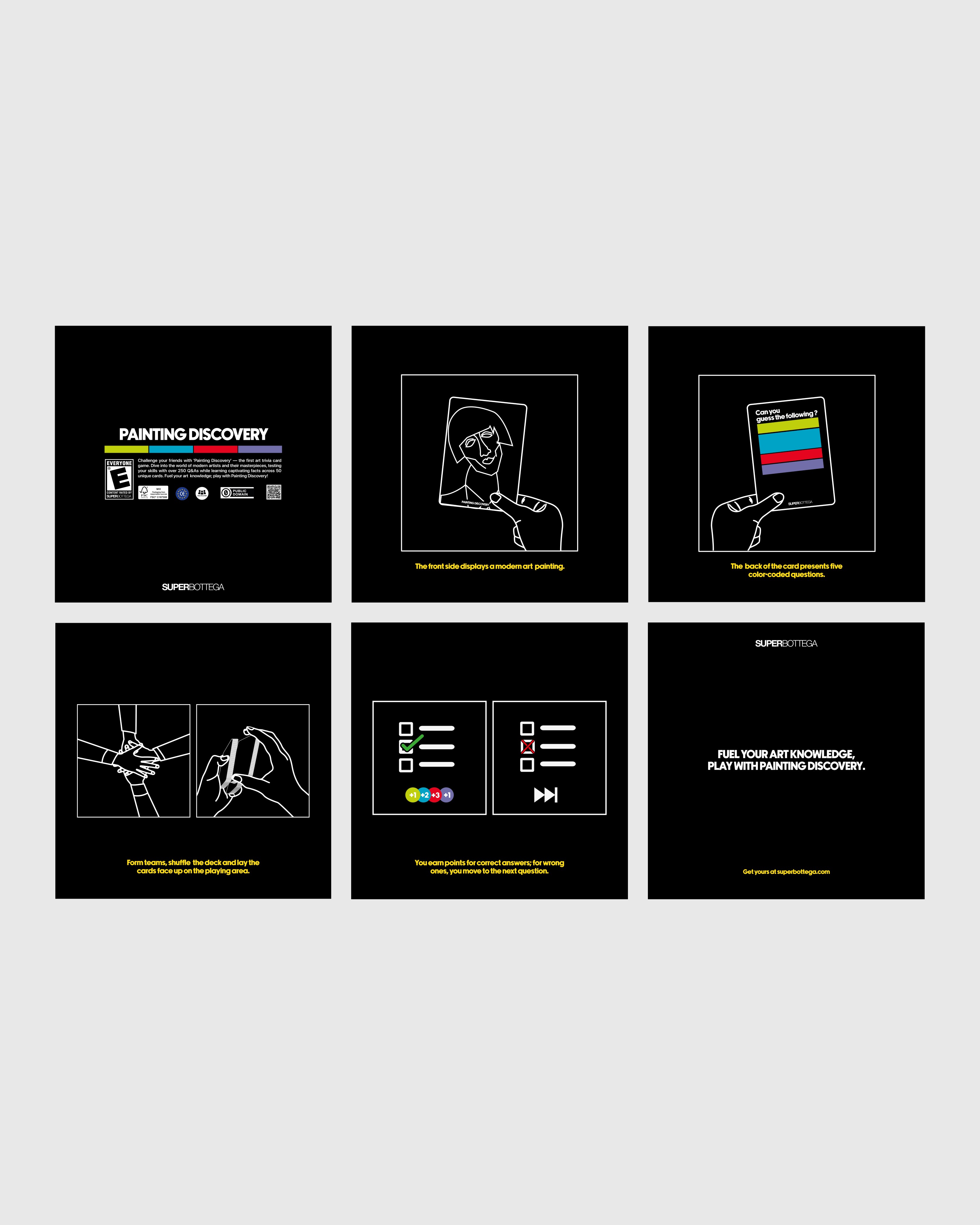
Painting Discovery, created in collaboration with SuperBottega, is a trivia card game entirely dedicated to art. The game comes in a box containing 50 customized cards. On one side of each card, you'll find a selection of iconic modern art pieces, while the other side features 5 questions that delve into the artwork and its creator. Players challenge each other by drawing cards and answering questions and trivia about the great figures of modern art.
Client
SuperBottega
Category
Product Desnig
,
Packaging Design
Year
2024
Tools / Softwares
Figma / Illustrator / Rhino
Client
SuperBottega
Category
Product Design
,
Packaging Design
Year
2023
Tools / Softwares
Figma / Illustrator / Photoshop


Project challenges
Despite a strong conceptual foundation, the game required a visual identity that would stand out from traditional card games while appealing to a diverse audience. Since the game’s objective is to "learn while playing," the cards needed to strike a balance between aesthetic appeal and an informative design, accommodating rich text.
Roles & Solutions
As the graphic designer responsible for the game's visual elements, I designed both the 51 cards layouts and the outer box. The cards were designed with an oversized feel, featuring large rounded corners (105x148mm) and 150gsm art paper with a matte finish to enhance the tactile experience and fully showcase the visual identity of the artworks. The use of colors on the card backs helps users become familiar with the game’s identity and allows for quick scanning of the text structure.
Room for Improvements
User surveys conducted after the game’s launch showed strong appreciation for both the game and its visual identity. However, they also highlighted issues with color contrast, noting that improvements should be made in future versions. Black, when used with small text on colored backgrounds, can be tricky. It's essential to test contrast levels and ensure full readability in projects like this.


Product & Accessory Design
Lures Originals
Product & Accessory Design
Lures Originals
Product & Accessory Design
Lures Originals


UI Design
Zeroone Website
UI Design
Zeroone Website
UI Design
Zeroone Website


UI Design / E-Commerce
LM Rive Gauche
UI Design / E-Commerce
LM Rive Gauche
UI Design / E-Commerce
LM Rive Gauche
Copyrights Matteo De Clercq © 2024 All Right Reserved
Made by M Studio
Copyrights Matteo De Clercq © 2024 All Right Reserved
Made by M Studio
Copyrights Matteo De Clercq © 2024 All Right Reserved
Made by M Studio